— PROJECT NAME
Vibra
— ROLE
Product Designer
UX Researcher
Vibra is an app for the tattoo community. A social network to put users and tattoo artists in contact with each other, facilitating the hiring and payment of the service.
For two weeks, me and my partner Juan Catala developed all the UX research and UX/UI design work,
First of all, we decided to carry out an initial investigation of problems that could have a technological solution. This led us to delve into the tattoo community, observing the following stament problem: People interested in tattoos do not know how to hire new international freelance tattoo artists that adapt to their economic capacity, their style of tattoos and their health needs.
By means of design thinking we made the design using the following methodologies and tools:
EMPATHIZE: • Desk Research • Surveys • Interviews • Competitive Analysis
DEFINE: • User Persona • User Journey • Affinity Diagram • Blue Print Strategy
IDEATE: • Brainstorming • MoSCoW • Impact & Effort • User Flow • User Case
PROTOTYPE: •Crazy 8 • Low-Fi • Mid-Fi • Hi-Fi
TESTING: • 5 second testing
TOOLS: • Figma• Adobe Ilustrator • Adobe Photoshop • Maze • Condens.
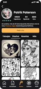
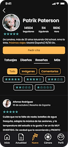
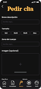
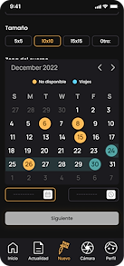
Part of the final prototype for iOS
In this first phase, our focus was on researching the tattoo community. To create a successful outcome, it’s crucial to conduct user research by utilizing tools that help us comprehend the user’s needs, challenges, and experiences.
Our desk research showed that there’s a shortage of public data on tattooing in Spain and Europe, and we barely discovered any estimates of the population. As a result, we placed more emphasis on the UX research phase, particularly surveys and interviews, conducting 200 surveys and 14 interviews.
During this phase the Condens software has helped us a lot to organise all the research, as well as to transcribe and analyse the collected information.
We conducted closed surveys with both tattoo artists and individuals interested in the industry. This allowed us to uncover some of the challenges and needs of the users. We inquired about their preferences, sources of inspiration, payment methods, techniques, age, among others.
Some of the important data obtained include:
Continuing our research, we conducted 15 semi-structured interviews with individuals in the industry and notable personalities. Semi-structured interviews allow for a more open and natural exchange of information with the interviewees compared to a closed interview.
The questions we asked included:
During this phase, we gathered crucial information, such as tattoo artists spending a significant amount of time coordinating appointments through various methods of contact, such as Instagram, TikTok, WhatsApp, and phone. Meanwhile, individuals interested in getting a tattoo are unaware of an efficient method for making appointments.
Using the data gathered in the first phase of our research, we conducted a competitive analysis to examine our competitors, their practices, strengths, and weaknesses. This information will inform the development of our future product.
Due to limited time, we were unable to employ additional research methods, such as a focus group. In my view, conducting a focus group would have provided valuable complementary information. Focus groups not only provide insights into people's perceptions of the product, but also give us a deeper understanding of the community.
We started to define using the data from the research, and by first carrying out two User personas, for the two flows we have: tattoo artists and people interested in getting a tattoo.
With the user persona and the data collected during the UX research phase, we create a user journey. It serves to understand and visualize the user experience from a holistic perspective, identifying strengths and weaknesses in the experience and informing and guiding design decisions and experience improvements.
An Affinity Diagram is used to organise the ideas. This way we have relevant information sorted by categories, which is essential for the following phases of the process.
During the ideation phase, we carried out an initial brainstorming of ideas. Afterwards, we put the ideas into a MosCow & Impact and Effort. Instead of doing this step separately, we have decided to combine the two methods into one. This way we know what we need, but also the impact and effort required.
Continuing with the project development, we carried out two user flows that will serve as the basis for us to know how many screens we need to design. We also used the user case technique to validate and prioritize product functionality.


To finish the ideation phase we make a crazy 8. In 8 minutes we draw 8 screens, in this way we have an approximation of what our product could be.
Following the sketches made in the Crazy 8, we have decided to make a low-fi in Figma for a first design approximation. To do this, we have taken into account all the phases of the process and the data collected through the UX Research.
After the low-fi, we decided to quickly test it with 3 users and taking into account their feedback, we made some changes and added copywriting in some parts of the sketch. Some examples of the home, calendar and chat are as follows:
We started working on the high-fi. First of all we chose a design style, in dark mode, something more attractive for the young people. We also decided on the logo, typography and colours, following this premise:
• According to color psychology, the color orange represents joy, enthusiasm, and fun.
• The wave-like design of the typeface represents the vibration of the machine during tattooing.
• We searched for a typeface that conveyed movement, but still had classic elements, as it is a serif typeface. This way, we can connect with users from different generations.
• We developed the design style based on the research we conducted on our target users.
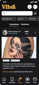
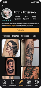
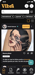
After starting as the Design System, we began to transition from sketches to high-fidelity. Previously, we automated processes by creating components following the atomic design. Here are some examples of screens from one of the flows
Finally we prototype all the screens, and test that everything works well. The result of one of the flows can be seen in the following video:
High-fi prototype. User flow: Client.
Finally, we conducted testing. By using the 5-second test technique in Maze, we gathered information on users' thoughts and feelings while using the app. The results were positive, as most users associated the app with the desired adjectives we aimed to identify the brand with.
After completing the project, some things we consider developing in the future are:
• Add an onboarding process.
• Develop the news section.
• Add 24-hour reels.
• Create a third flow for rental spaces. 5. Introduce the option for streaming


